
Creating Animated Visualizations in Tableau
- Bernard Kilonzo

- Apr 10, 2020
- 3 min read
Updated: Jan 3, 2025
A viz animation helps you see and understand data as it changes. By putting your data in motion highly impacts your data analysis, presentation and storytelling work – creating animations can engage users in ways other visualization types may not be able to. Animation can help users see the transition from one state to the next – enabling users easily track changes as part of visualization move from one position to another.
A very good example of an animated viz is in this presentation by Hans Rosling a professor of international health at Sweden’s Karolinska Institute, and the founder of Gapminder. (In this example, Hans explores data on fertility rate versus life expectancy – revealing trends not easily depictable in static visualizations)
So, how do I animate a viz in Tableau?
You animate vizzes in Tableau by dropping the relevant dimensions in the pages shelf - and with the help of the animation feature introduced in Tableau 2020.1 customize your animations.
In Tableau you can animate a variety of vizzes ranging from line to bar charts to circle/bubble charts etc.
In this post, I’ll explore two separate examples on how to create and animate vizzes.
Animating - Circles
In this example, I explore data on Life expectancy at birth against the number of live births per woman and Population – across the globe according to UNdata. The data runs between 1950 -2100 – with part of the data based on projections.
Download data here
Building the view;
Drag measure fields Life expectant and Fertility rate to the row and columns shelf respectively.
Drag dimension ‘Country or Area’ to the detail shelf –or alternatively uncheck ‘aggregated measures’ under the analytics menu.
Choose circles under marks card.
Drag dimension ‘Country or Area’ to the color shelf.
Drag measure field ‘Estimated Population’ to the Size shelf.
Lastly – drag dimension ‘Year’ to the Pages shelf to animated your viz

Note: Under format menu you can access ‘Annotations...’ and use it in customizing your animation.
Executing this and playing it we've;

Animating - Bars (Bar chart race)
In this second example, I’ll be using the same UNdata above – to create a bar chart race showing Life expectancy for different countries between 1950 – 2100.
Creating the view;
Drag SUM(Life expectant) to the columns shelf
Add dimension ‘Country or Area’ to the label and color shelf
Create a calculated field ‘Rank’ as shown below.
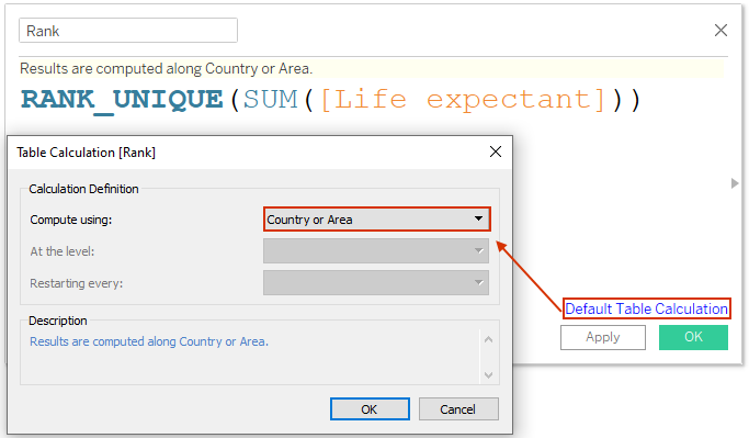
(Ensure the calculation is computed along ‘Country or Area’)
Drag this calculation Rank to the row shelf and change it to discrete
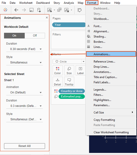
Add dimension Year to the Pages shelf and turn on animation under Format menu
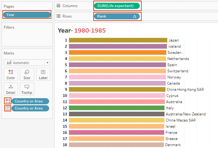
Executing this and playing it we’ve;

How to add animations in your Tableau public vizzes
For odd published vizzes, you can add animations in the following;
Sign into your profile
Click on the viz you want to turn on the animations
Click edit to edit the viz in the browser
Go to Format > Animations… > turn it On
Save your viz and close

Parting shot!!
Animations are simple to create yet their impact in data storytelling is immeasurable. With Tableau public supporting this feature – means you can begin right now - by changing how you look at data and present your reports.
I hope this post was helpful to you. To receive more of the Tableau tips and trick – kindly subscribe to our mailing list.
Thank you for reading.