
Visualizing Survey Data in Tableau
- Bernard Kilonzo

- Jun 10, 2022
- 6 min read
Updated: Apr 22

Introduction
Survey data is the resultant data that is collected from a sample of respondents that participated in a survey. This data contains comprehensive information about a specific topic gathered from the target audience – and collected using different methods such as, in-person interviews, telephone interviews, mailed questionnaires, online questionnaires etc.
Data visualization on the other hand is the practice of translating information into visual context such as a map or graph, to make the data easier for human interpretation.
In this article, I will be sharing tips on how you can visualize your survey data in Tableau – making the data more user friendly, interpretable, and actionable.
1. Get the data ready for analysis (Reshape and optimize data for analysis)
Before you can begin analyzing and visualizing your survey data, you need first to get the data in the right shape (reshape the data). Data reshaping in this context simply refers to converting the data from crosstab format to columnar format (optimize the data for analysis), or simply put - pivot the data.
Pivoting data is simply a technique of data reshaping that rotates data from the state of rows to the state of columns (converts data from crosstab format to columnar format).
Original data before reshaping…

(This data shows how the original data downloaded from a survey system would look like, with each row representing a respondent, and questions from the questionnaire represented in separate columns).
Reshaping (pivoting) the data, will result to the sample data shown below (in this case, I have pivoted all the survey questions except the demographic questions).

(The pivoted data is packed into two columns – one column contains the column headers (Question ID) while the other contains the values (Text Values), note when you pivot data – each respondent is listed X times (where X is the number of questions (columns) included in the pivot), so by pivoting data we’re simply mapping each respondent to every question - which leads to more rows in the Tableau data source, or duplicated respondents).
Helpful: Learn how to pivot data in Tableau
You can also prepare your data further - by including, both the text and numeric values, as well as the meta data to simplify the data for analysis.
Below is a snapshot of what a more optimized survey data would look like! – ‘The prepared survey data’.

Note you can use data preparation tools such as Alteryx, Tableau Prep among others - to prepare your survey data.
2. Visualizing demographic data
Demographic data is information about groups of people according to certain attributes such as age, gender, education, income etc. Before you can visualize your survey data, you may want to get a sense of how many responses you received, and how the responses are broken down by these demographic attributes.
This can be achieved by using the Count Distinct function COUNTD ([Respondent ID]), (Where Respondent ID is a unique field representing each respondent in the data) to return the number of respondents by demographic profile.
Once you’ve compiled these demographic attributes into a dashboard, you can add some interactivity to show the relationships among the demographic profiles.

(Sample dashboard visualizing demographic data)
3. Visualizing Yes/No data
This is data from questions that can only be answered ‘YES’ or ‘NO’ (sometimes can include other variables). Such data can be visualized to show the percent of respondents that selected a certain option. For example, let’s assume you would like to know the percent of respondents that answered ‘Yes’ on a certain question, you can compute that – using the following calculations.
Using Text Values
COUNTD (If [Text Values] =’Yes’ then [Respondent ID] END)/ COUNTD ([Respondent ID])
Using Numeric Values
(Assuming ‘Yes’=1 and ‘No’=0)
COUNTD (If [Numeric Values] =1 then [Respondent ID] END)/ COUNTD ([Respondent ID])
4. Visualizing single & multiple-response questions
Single response questions are questions which allow respondents to select only one answer. While multiple-response questions are questions which allow respondents to select one or more options from a list of answers that you define.
Example of a single-response question

Example of a multiple-response question

Such questions can be visualized to determine the percent of respondents by response.
For example, using the prepared data – I can visualize the single response question as follows.
Add Text Values to the rows (to show the responses)
Add COUNTD (Respondent ID) to the columns (to show the number of respondents by response)
Add table calculation ‘Percent of Total’ computed down the table
Lastly add the field ‘Question’ as a filter and select the question of interest, in this case. ‘How did you first hear about our courses?’

Likewise, I can visualize the multiple response question as follows.
Repeat the same steps applied for the case of single response question above.
On the last step, filter the question you’re interested in – in this case. ‘What kind of content, helped you grasp the concepts quickly?’ Which is a multiple response question.

5. Visualizing Likert scale data
Likert scale is a rating scale used to assess opinions, attitudes, or behaviors.
A good example of a Likert scale is in the question below.

Such questions can be visualized to show the percent of respondents by the various responses.
To visualize such data using the prepared survey data,
Filter the data by the Question you would like to visualize, in this case ‘Please evaluate the overall quality of materials/instructions provided by the trainers?’
Add Wording to the rows (to show the different statements being evaluated)
Add COUNTD (Respondent ID) to the columns (to show the total respondents per statement)
Add table calculation ‘Percent of Total’ (computed across the table)
Add the Text Values (responses) to the color shelf (to break-down the analysis by responses)
Order the responses accordingly on the legend shelf.
Resulting to.

6. Net promoter score (NPS) analysis
Net promoter score question is simply a rating scale type of question. These questions use a scale of 0-to-10, to gauge the likelihood of customers recommending products or services to others.
Below is a good example of Net Promoter Score question.

Respondents that provide a rating of 0 to 6 are considered as ‘detractors’, while those that provide a rating of 7 or 8 are considered as ‘Neutral’, with those rating 9 to 10 being considered as ‘promoters’.
The Net Promoter Score (NPS) is computed by taking ‘the percent of promoters’ minus ‘the percent of detractors’.
NPS Calculation = (Total % of Promoters) – (Total % of detractors)
To visualize the Net Promoter Score using the prepared survey data.
First categorize the respondents as either ‘Detractors’, ‘Neutral’ or ‘Promoters’ using the calculation below.

Compute the Net Promoter Score (NPS) using the following calculation.

Next build the view...
Filter the data by the Question you would like to visualize, in this case ‘How likely are you to recommend our products to a friend or a colleague?’
Add Wording to the rows (to show the different statements being evaluated)
Add COUNTD (Respondent ID) to the columns (to show the total respondents per statement)
Add table calculation ‘Percent of Total’ (computed across the table)
Add the ‘Respondent Category’ computed above to the color shelf (to break-down the analysis by respondent category)
Order the respondent categories accordingly on the legend shelf.
Include the NPS values on the view by creating a dual axis chart.

Create a Survey Analysis Dashboard
Survey dashboard is a tool that allows users explore, and filter survey items all in one location based on various demographic profiles. In this case, a survey analysis dashboard would combine all these different analyses and vizzes – to create a single view where you can track all these metrics at once.
Check sample of an interactive survey analysis dashboard below. (click on the dashboard to interact with it)
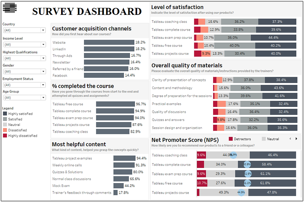
(With this dashboard, users can explore, track different survey items, and filter survey items by different demographic profiles)
Helpful: Learn how to create a survey analysis dashboard in Tableau – (Tableau projects for practice!)
Conclusion
If you have been consuming survey findings using the boring static tables and sketchy vizzes - which communicate little about your study. Now you can bring some excitement and interaction to your survey reports by using mainstream data visualization tools such as Tableau and others to visualize your survey data.
I believe this article was somewhat helpful to you. If you would wish to receive more Tableau tips and tricks, kindly join our mailing list by subscribing below.
If you like the work we do and would like to work with us, drop us an email on our Contacts page and we’ll reach out!
Thank you for reading!