Visualizing Data Variability with Jittered Boxplots in R
- Bernard Kilonzo

- Jul 29, 2025
- 2 min read

Overview
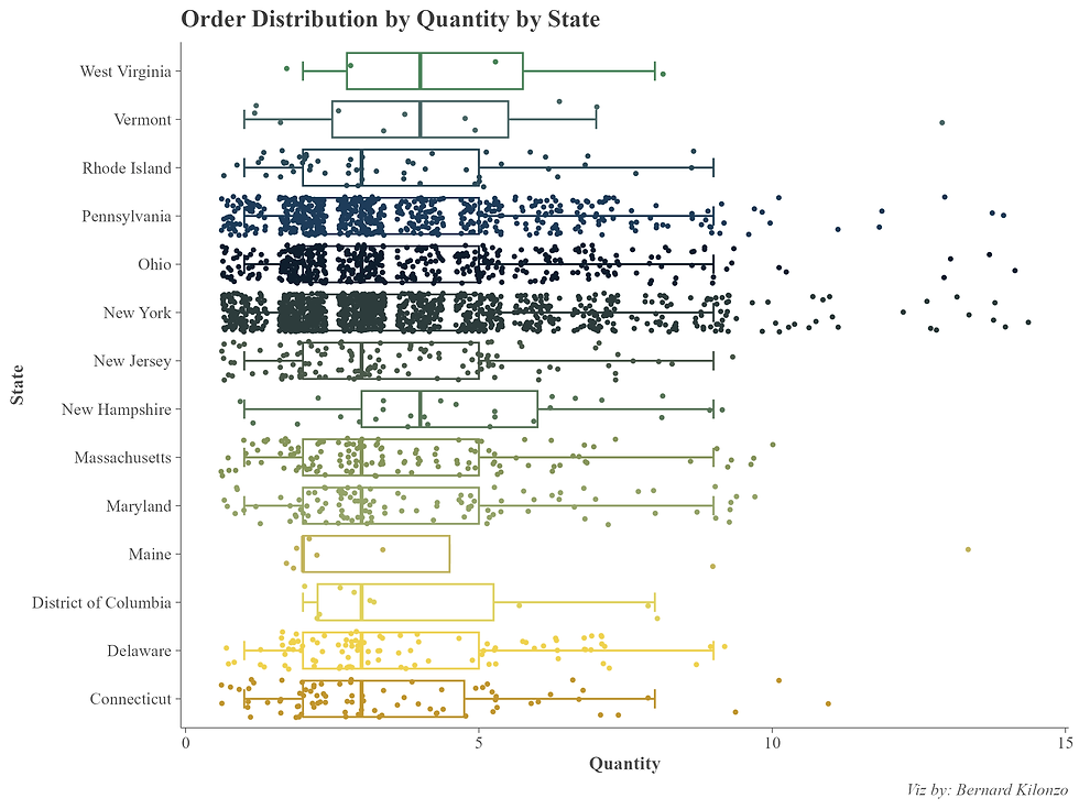
A jitter boxplot is a hybrid data visualization that overlays individual data points with random horizontal displacement (jitter) onto a traditional boxplot. This combination enhances the interpretability of data by showing both summary statistics and the actual distribution of values.
Example of a Jitter Box Plot

Step-by-Step Guide
Load libraries
# load librarieslibrary(tidyverse)
library(paletteer)Load data
# load datasuperstore<-read.csv("https://raw.githubusercontent.com/bernardkilonzo-rigor/dataviz/main/data/Sample%20-%20Superstore.csv")Create a simple jitter box plot.
# creating jitter box plotsuperstore%>%filter(Region=="East")%>%ggplot(aes(y = State, x = Quantity, color = State))+
stat_boxplot(geom = "errorbar",width =0.4)+
geom_boxplot(outlier.color = NA)+#removing the outliers
geom_jitter(size =0.7)See the resulting view.

Formatting and customizing the plot.
# creating and formatting jitter box plotsuperstore%>%filter(Region=="East")%>%ggplot(aes(y = State, x = Quantity, color = State))+
stat_boxplot(geom = "errorbar",width =0.4)+
geom_boxplot(outlier.color = NA)+#removing the outliers
geom_jitter(size =0.7)+
scale_color_paletteer_d("impressionist.colors::irissen")+
labs(title = "Order Distribution by Quantity by State",
caption = "Viz by: Bernard Kilonzo")+
theme(panel.background = element_blank(),
axis.line = element_line(color = "gray30", linewidth = 0.2),
axis.ticks = element_line(color = "gray30", linewidth = 0.2),
axis.title = element_text(family = "serif", size = 10,face = "bold", color = "gray30"),
axis.text = element_text(family = "serif", size = 9, color = "gray30"),
legend.position = "none",
plot.title = element_text(family = "serif", face = "bold", size = 13, color = "gray25"),
plot.caption = element_text(family = "serif", face = "italic", size = 9, color = "gray35"))See the resulting final view.

Conclusion
Creating a jitter boxplot in R is a powerful way to explore the intricacies of your dataset by merging statistical summaries with raw data visibility. Through the use of ggplot2 and its complementary geom_boxplot() and geom_jitter() layers, analysts gain a clear view of central tendencies, variability, and individual data points - all in one visualization.
This hybrid plot is especially effective in scenarios where overplotting may obscure patterns, such as repeated values or tightly clustered groups. By jittering the points, subtle distributions emerge that standard boxplots might miss.
Whether you're working in biology, sociology, business analytics, or any field involving grouped data, jitter boxplots in R offer both elegance and insight. With just a few lines of code, you can turn raw numbers into a compelling visual narrative.
If you like the work we do and would like to work with us, drop us an email on our contacts page and we’ll reach out!
Thank you for reading!
