
How to Create Jitter Box Plots in Tableau
- Bernard Kilonzo
- Jul 26, 2025
- 2 min read
Updated: Jul 29, 2025

What is a Jitter Box Plot?
A jitter boxplot is a combination of a traditional boxplot and a jitter plot, where the boxplot shows the summary statistics of the data (like median, quartiles, and potential outliers), while jittered points are overlaid to show the individual data points. The jitter refers to adding a small amount of random noise to the position of each point along the categorical or numeric axis, which helps to avoid the overplotting problem where many points overlap exactly. This way, you can visualize both the overall distribution (with the boxplot) and the individual observations more clearly.
Example of a Jitter Box Plot

Step-by-Step Guide
To create a simple jitter box plot in Tableau using the Sample – Superstore dataset.
Drag Quantity to the rows shelf.
Drag Order ID to the Detail shelf (to break down each dot by Order).
Change marks type to Circle.
Adjust the size of the dots under the Size shelf.
Drag State to the columns shelf.
Add Region to the filter shelf – and filter any Region.

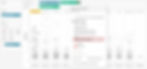
Next, from the analytics pane – drag Box Plot to the view as shown below.

See the resulting view.

Next, you need to spread out the overlapping points so you can better see how many there are and their distribution.
To do so, create the following calculation.

Drag the above calculation to the Columns shelf.
Edit the table calculation and compute it using the Order ID (dimension added to the Detail shelf)
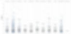
See the resulting view.

Notice the dots are spread-out beyond the box plot.
And because the dots are spread out between -1 and 1, you can correct this by fixing the axis range to something like -2 to 2 (or any other range that gives you the desired view).
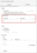
To do so, right-click on the axis and choose Edit axis…

Fix the axis range from -2 to 2, as shown below.
See the resulting view.
Conclusion
Creating a jitter boxplot in Tableau unlocks powerful insights by blending the clarity of summary statistics with the granularity of raw data. By overlaying jittered individual data points on top of traditional boxplots, you gain a complete sense of both overall trends and the underlying distribution of your dataset. This approach helps uncover patterns, clusters, and outliers that simple boxplots might hide. With Tableau’s flexibility - through calculated fields, dual-axis charts, and creative formatting - you can build these advanced visualizations without needing complex scripting. Mastering this technique enhances your ability to communicate data stories more transparently and effectively, empowering better decision-making and deeper audience understanding.
If you like the work we do and would like to work with us, drop us an email on our contacts page and we’ll reach out!
Thank you for reading!