
Top 10 Types of Charts and Graphs in Data Visualization
- Bernard Kilonzo

- Jan 4, 2020
- 4 min read
Updated: Jan 2, 2025

Charts and graphs are the building blocks of data visualization – and your dashboards. And choosing the right chart and graph impacts immensely on how well your data story is conveyed. With different goals and use cases of every chart and graph, you don’t want to make the mistake of using the wrong viz in your data story. Some of the common use cases of charts and graphs are;
Showing comparison among items.
Showing comparison of overtime.
Indicating composition – part to whole relationship.
Showing correlation – relationship between variables.
Showing distribution of data (frequency of values in data).
Performing location analysis.
Showing Key Performance Indicators (KPIs) – important business information.
Therefore in this brief article, I'll explore 10 common charts and graphs in data visualization.
Want a free guide + 35 data visualizations widgets to help you fast track your data visualization skills? Right here;

1. Bar & Column Chart

Bar chart displays values in the horizontal X-axis while Column chart displays values in the vertical Y-axis.
Both the charts are useful when you need to show comparison among discrete categories. For instance, comparing different products or items in a retail store.
Best practices
Whenever axis and labels are used at the same time, be careful not to clutter your viz.
Sorting the bars (case of bar chart) makes the viz more user friendly.
All bars should be in the same color.
Grind lines used within the viz should be blurred to avoid clutter.
Provide additional details on the tooltip.
2. Pie Chart

Pie chart just like donut chart is useful when you need to show numerical proportions – parts to whole.
Best practices
Do not use if pie dimension has more than three categories.
Avoid pie chart if the goal is to help user make fine distinctions.
Label the chart clearly.
Provide additional details on the tooltip.
3. Histogram Graph

Histogram graph just like the box plot is used to show distribution of data. By appearance, it looks like a column chart – unlike column chart, histogram is created by grouping values into ranges (bins).
The height of the bar shows the number of values falling within a particular range.
Best practices
Ensure the chart tells a meaningful story by choosing the right bin sizes. Avoid choosing too wide or too small bin size.
Provide additional details on the tooltip.
Label the axis & bins clearly.
If need be, use parameters to let users select the appropriate bin size.
4. Bullet Chart

Bullet chart is a variation of bar charts developed by Stephen Few as a replacement of dashboard gauges and meters. Generally used to show progress towards a certain goal. A good example would be illustrating actual sales and progress towards the target sales.
Best practices
Show and label axis clearly.
Provide more details on the tooltip.
Use color, and borders conservatively to avoid clutter.
5. Funnel Chart

Funnel chart is used to illustrate stages in a Sales process and show the amount of potential revenue for each stage. Funnel chart displays values as progressively decreasing proportions amounting to 100 percent in total.
This chart can be useful in identifying potential problem areas in an organization’s sales processes.
Best practices
Label the chart appropriately.
Use annotations to properly label small entities.
Provide additional details on the tooltip.
Use color conservatively.
6. Line Chart
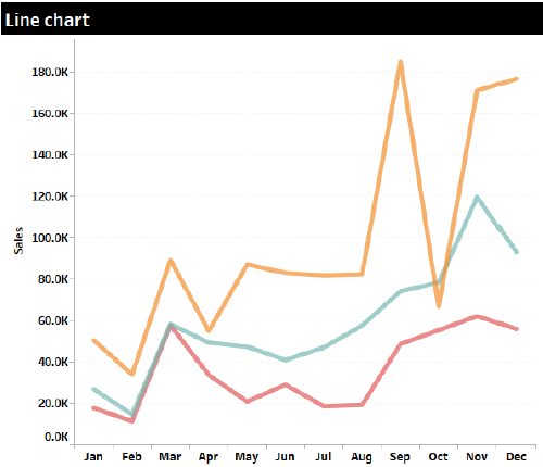
Line chart is used to display information as a series of data points connected by straight lines. Commonly used to show trends overtime. Useful when you need to show the trend of several dimension members overtime.
Best practices
Avoid using line chart when you’re dealing with a large number of dimension members as it makes the chart busy. If this is unavoidable, enable highlighting features for users to filter the mess by highlighting specific fields.
Always show the axes and field names clearly.
When labelling values, ensure their orientation is horizontal.
Provide additional details on the tooltip.
7. Area Chart

Area chart is based on a Line chart. Only that the space between the axis and line is emphasized with color or textures. This chart is useful when visualizing changes overtime (trends).
Best practices
Always label the axis and fields clearly.
Avoid using dimensions with more categories in an area chart as it can lead to clutter.
Use color appropriately with the right balance.
Where necessary provide additional details on the tooltip.
8. Filled Map
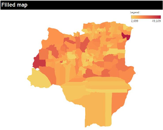
Filled maps are used to visualize geographical data as polygons on map. With values color coded to illustrate patterns across geographical areas.
Best practices
Use color appropriately so not to give wrong indications.
Provide additional details and even vizzes on the tooltip to give more information.
9. Bubble Chart

Bubble chart is a variation of scatter chart in which data points are replaced with bubbles. With the size of bubble indicating the volume of the data. Other measures can be illustrated using color to enable deeper comparison. Size=Sales
Best practices
Use color conservatively as can lead to clutter – especially when adding more fields.
Label the bubbles clearly.
Provide additional details on the tooltip.
10. Numeric Indicator
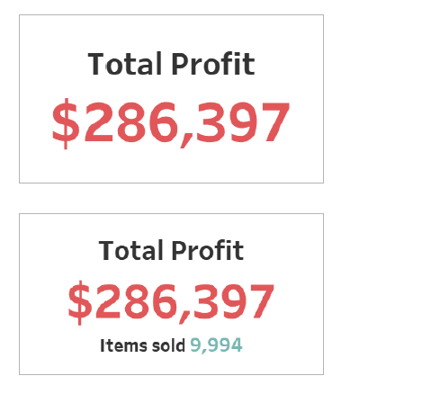
Numeric indicators are used for visualizing Key Performance Indicators (KPI’s) or important business information.
They can be used as a single value or two values to add some context.
Final thoughts
These are some of the common graphs and charts for data visualization. If you would like to learn more on data visualization. I suggest you begin by learning the basics.
If you would like to receive more updates on data visualization, kindly subscribe to the emailing list below.
If you like the work we do and would like to work with us, drop us an email on our Contacts page and we’ll reach out!
Thank you for reading!