
Beyond Static: Creating Impact with Dynamic Color Ranges in Tableau
- Bernard Kilonzo

- Jul 5, 2025
- 2 min read

Overview
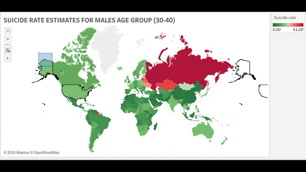
Dynamic color ranges in Tableau refer to color scales that automatically adjust based on user interactions. This technique is applicable when visualizing data that has extremely high values (outliers). This is because when you visualize data that has outliers - the existing difference between the non-extreme values can be lost giving wrong indication and interpretation.

(For example, in the above map - because of high values in some of the Asian countries, the interpretation on other regions like Africa, North and South America can be lost.)
Note: This can be resolved by implementing dynamic color ranges using parameters – allowing users to automatically update the color scales based on their interaction with the view.
To resolve this…
Create Parameters
Create the Start and End parameters as shown below.


Note these parameters have the data type integer.
Next, edit the colors (color legend) and replace the start and end values with the parameters you’ve just created above as shown below.

Add Interactivity with Parameter Actions
Go to the Worksheet menu >> Actions

Add parameter actions.

Add the first parameter action – targeting the “Start” parameter value, set the source field as the measure field applied to the color in this case “Suicide rates”, and the aggregation as Minimum.
Lastly, I have set the parameter to default to zero when you clear the selection. Note: Zero is also the minimum value in my dataset.

Repeat the same process to configure the second parameter action as shown below.

Note: The aggregation here is set as Maximum, while the parameter is set to default to 81 when you clear the selection. Note: 81 is also the Maximum value in my dataset.
Interacting with the Visualization
From the above gif, you can now interactively update color ranges based on your selection -empowering you to look and interpret data relative to your selection.
Conclusion
Dynamic color ranges in Tableau offer more than just aesthetic appeal - they're a powerful mechanism for enhancing clarity, reinforcing insights, and adapting visual storytelling to the flow of data. By leveraging parameters and parameter actions, developers can build visualization that respond to user interactions – providing flexible control over color scales, ensuring that key data distinctions remain clear even when viewed through different accessibility lenses.
If you like the work we do and would like to work with us, drop us an email on our contacts page and we’ll reach out!
Thank you for reading!