
Visualizing Likert Scale Data with the Likert Package in R: A Practical Guide
- Bernard Kilonzo

- Jul 24, 2025
- 2 min read
Updated: Aug 18, 2025

Overview
Likert scale data refers to the type of responses collected using a Likert scale - a common tool in surveys to measure people's attitudes, opinions, or perceptions. It’s named after psychologist Rensis Likert, who developed the method in the 1930s.
Example of Likert Scale Question

Likert package on the other hand makes it easier to summarize and visualize this kind of data, especially when you've collected responses from many people across multiple questions. It helps you turn those raw opinions into clear, attractive plots so the insights stand out.
In this article, I am going to share a practical guide to visualizing Likert scale data in R.
Step-by-Step Guide
Load the required packages
# load libraries

library(tidyverse)
library(likert)
Load data
# load data

survey_data<-read.csv("https://raw.githubusercontent.com/bernardkilonzo-rigor/dataviz/main/data/Survey%20Data.csv")
Select the Likert scale data, in this case I am only interested in question 4 in my data (Q4).
# Selecting the likert scale data (Q4)

q4<-survey_data%>%select(contains("Q4"))
Next, convert Likert items into ordered factors.
# Converting likert items into ordered factors

q4[]<-lapply(q4, factor, levels =c("Highly dissatisfied","Dissatisfied","Neutral","Satisfied", "Highly satisfied"))
Next, use the Likert function to summarize Likert items across questions.
# using likert() to summarize likert items across questions

likert_summary<-likert(q4)
See the resulting summary data.
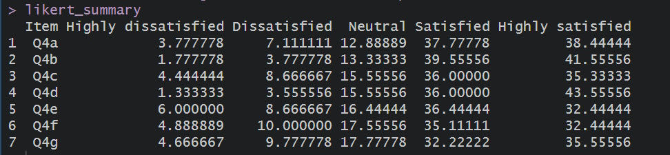
Create a plot
# create a plot
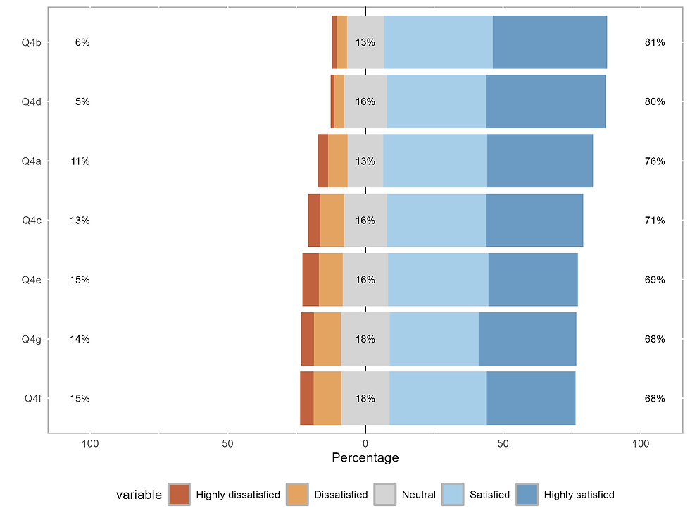
plot(likert_summary)See the resulting view.

Customizing the colors of the view as follows.
# customize the plot with scale_fill_manual function

plot(likert_summary)+scale_fill_manual(values = c("#bf623d", "#e3a462", "#d4d4d4", "#a7cee8", "#6b9bc2"))
See the revised view.
Conclusion
Visualizing Likert scale data using the Likert package in R provides an intuitive and effective way to transform survey responses into actionable insights. By summarizing and plotting response distributions across multiple questions, the package helps researchers, analysts, and decision-makers quickly grasp patterns of agreement, disagreement, or neutrality within their data.
If you like the work we do and would like to work with us, drop us an email on our contacts page and we’ll reach out!
Thank you for reading!