
How to create a progress bar chart in Tableau
- Bernard Kilonzo
- Mar 8, 2023
- 2 min read
Updated: Jan 8, 2025

Introduction
In one of the previous articles, I demonstrated how to create a progress doughnut chart in Tableau to visualize the percent of completion on a single metric.
Read the article here.
In this article, I’ll use the same data to demonstrate how to visualize progress using a bar chart instead of a donut chart.
Sample data

(Note, unlike in the case of progress donut chart – in this case we don’t need the Gap values which is the distance between the achieved value and 100% mark)
Let’s build the view (Option 1)
Once you connect the sample data, first create a calculated field which returns the maximum achievable value in this case 100% as shown below.

Next,
Drag the dimension Project Task to the rows shelf.
Drag the SUM(% Complete) to the columns shelf.
Drag the AVG(Maximum value (100%)) to the columns shelf.

Make the chart dual axis and synchronize the axis.
Format the axis/values to percent.
Customize the color of the respective charts (make the 100% chart lighter with a border, and the % complete chart make the color more intense).
Label the % complete chart.
Option 2
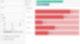
Repeat the same procedure above, but now in this case make the ‘% Complete’ chart thicker than the ‘100% chart’ by simply adjusting the size.
Resulting to.
Option 3
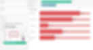
Or you can repeat the same procedure, then make the ‘100% chart’ thicker and the ‘% Complete’ chart thinner by simply adjusting the respective sizes.
Resulting to.

Conclusion
If this post was helpful and you would like to receive more of these Tableau tips and tricks, kindly subscribe to our mailing list below.
If you like the work we do and would like to work with us, drop us an email on our Contacts page and we’ll reach out!
Thank you for reading!