
How to Create a Dumbbell Plot in R with ggplot2
- Bernard Kilonzo

- Jun 4, 2025
- 2 min read

Overview
A dumbbell plot is a type of visualization that highlights differences between two values for multiple categories. It’s especially useful for showing changes, comparisons, or gaps between two points in time, groups, or scenarios.
Example of a Dumbbell Plot

Code for the final plot can be found here!
Step-by-Step Guide
To create a dumbbell plot in R, load the libraries and data as shown below.
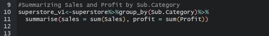
load librarieslibrary(tidyverse)library(scales)load datasuperstore<-read.csv("https://raw.githubusercontent.com/bernardkilonzo-rigor/dataviz/refs/heads/main/data/Sample%20-%20Superstore.csv")Summarize the Sales and Profit by Sub-category using the code below.
See the resulting data.

Using the summarized data, create a dumbbell plot using the code below.

Executing the above code results in the view below.

Creating a dumbbell chart with the ggalt package
Install and load the ggalt package in your R session.

Using the same data, create a dumbbell chart using the code below.

See the resulting plot.

Creating a dumbbell chart comparing more than two values
The Dumbbell chart can also be used to highlight differences between two or more values for multiple categories.
To do so, using the Superstore data, let’s create some data by summarizing Sales, Profit and Quantity by Region using the code below.

See the resulting data.

Next, shape the data through pivoting.

See the resulting data.

Create a dumbbell chart comparing the three values using the code below.

Executing the above code creates the plot below.

Conclusion
Dumbbell charts in R offer an intuitive, visually appealing, and informative way to present comparisons. Whether analyzing business metrics, social trends, or research findings, they serve as an excellent tool for data storytelling. Their simplicity, combined with the depth of insight they provide, makes them a valuable asset in analytical reporting.
If you like the work we do and would like to work with us, drop us an email on our contacts page and we’ll reach out!Thank you for reading!