
How to create a candlestick chart in Tableau
- Bernard Kilonzo

- Nov 17, 2022
- 4 min read
Updated: Aug 6, 2025

Introduction
Candlestick chart is a financial chart used to describe price movement of a security, derivative or currency. It is like a bar chart in that each candlestick represents all four important pieces of information for that day; Open and close in the thick body, high and low in the candle wick. The candlestick chart is used by traders to determine the possible price movement based on the past patterns – using the open price, close price, high and low caps.
Example of a candlestick chart

(Note, the area between the open and close is called the real body, the price excursions above and below the real body are shadows (also called wicks). Wicks illustrates the highest and lowest traded prices of an asset during the time interval represented. The body illustrates the opening and closing trades.)
The color of the candle represents the price movement relative to the prior period’s close.
A black (or red) candle represents a price action with a lower closing price than the prior candle’s close while a white (or green) candle represents a higher closing price than the prior candle’s close.

With that said, let’s get practical and learn how to create a candlestick chart in Tableau.
To do that, I’ll be using the New York Stock Exchange Data (S&P 500) by Kaggle, to show case two ways to create a candlestick chart in Tableau.
Here is the snapshot of the data.

(This data shows the trade metrics for each ticker symbol on a specific date)
Option One – using reference lines
Once you’ve connected the above data.
Create the candle wick first as follows.
Drag the dimension date to the rows shelf – change the level of detail to Exact Date (Discrete)
Drag the measure field high to the rows shelf – aggregate using AVG.
Drag the measure field low to the axis (to create a combined axis chart) – also aggregated using AVG.
Filter the view by Month/Year (Dec 2016) and ticker symbol (as shown in the view below)
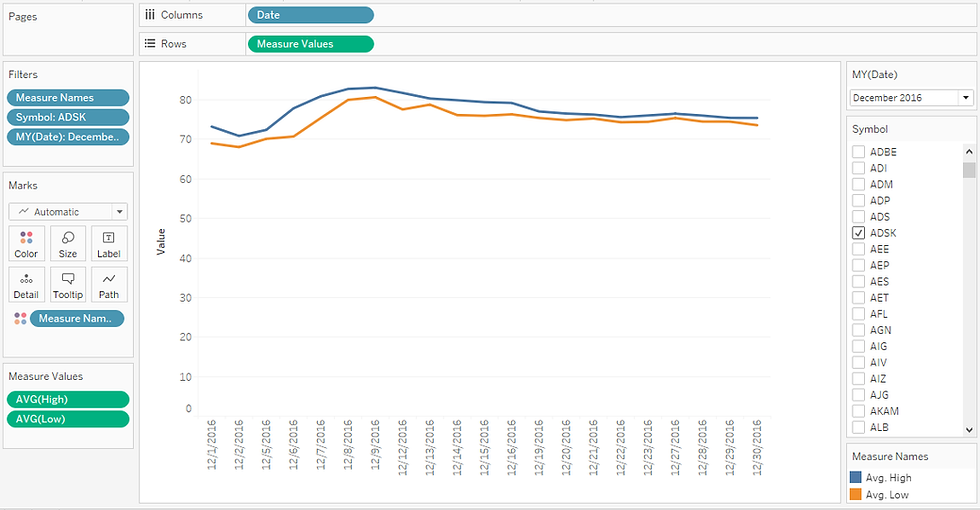
To create the candle wick, connect the high and low prices by dragging the Measure Names to the Path shelf.
Under Edit Axis…., uncheck the Include Zero option to zoom in the view.

Color the candle wick to show the price movement using the following calculation.

Adding the above calculation to the color shelf and customizing the colors we’ve.

Lastly, let’s add the real body as follows.
Drag Open and Close fields to the details shelf – aggregate using AVG.
Create a calculated field ‘Closed Up’ which returns the close price for cases where the close price is higher than the open price.

Add the above calculation to the detail shelf.
Next right-click on the axis, add a Reference Line – in this case, a reference band – Scope (per cell) and customize as follows.

(Notice this will insert the real body for candles with higher closing price than open price)
Repeat the same to add the remaining candle bodies as follows.
Create a calculated field ‘Closed Down’ as follows (which returns the open price for cases where the close price is lower than the open price).

Drag the above calculation to the detail shelf - and add another reference line as shown below.

(Notice this will insert the real body for candles with lower closing price than open price)
Executing this we’ve, the candlestick chart shown below.

Option Two – using Gantt bar
The other way to create a candlestick chart is by using a Gantt bar.
To do that,
Drag the field Date to the columns shelf – change the level of detail to Exact Date (Discrete)
Add High and Close fields to the rows – aggregate using AVG.
Make the view dual axis and synchronize the axis.
Change the marks card to Gantt bar.
Filter the view by Month/Year (Dec 2016) and ticker symbol as shown below.
Under Edit Axis…. Uncheck Include Zero, to zoom in the view.

Having set the base of the chart, next I’ll create two calculations to fill in the gap between the close and the open price, as well as between the high and the low price.


Next, select the first Gantt bar on AVG(high) and add the calculation GAP (high & low) to the size shelf - to fill-in the GAP between the high and low price.
Resize the Gantt bar, by minimizing its size to create the candle wick.

Repeat the same to fill-in the gap between the open and the close price, by dragging the calculation GAP (Open & Close) to the size shelf of the second Gantt bar on AVG(Close).
Resize the Gantt bar, by increasing its size to create the real body of the candle.

Next, add a color layer to show the price movement using the calculation below.
Adding the above calculation to the color shelf and customizing the colors we’ve.

(Which results to a candlestick chart just like in the previous example demonstrated above)
Conclusion
Next time you are working on a trade project, try one of the above options to create a candlestick chart – a powerful viz for traders to determine the possible price movement based on the past patterns.
I hope this article was helpful to you. If you wish to receive more Tableau tips and tricks, kindly join our mailing list by subscribing below.
If you like the work we do and would like to work with us, drop us an email on our contacts page and we’ll reach out!
Thank you for reading!