
How to Create a Bump Chart in Tableau with Viz Extensions
- Bernard Kilonzo

- Jul 16, 2025
- 2 min read

What is a Bump Chart?
A bump chart is a type of data visualization that shows how the rankings of different categories or entities change over time. Unlike a traditional line chart, where the y-axis represents a quantitative value, the bump chart’s y-axis shows rankings (for example, 1st, 2nd, 3rd, etc.), and the x-axis represents time or another ordering variable.
Each line in the chart represents a single category or item, and the way the lines move - rising, falling, or crossing over one another - makes it easy to spot how rankings shift at each time point. When lines cross, it signals that the relative ranking between two categories/entities has changed.
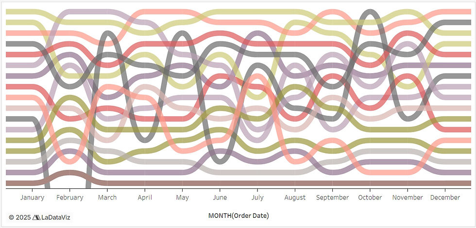
Example of a Bump Chart

Step-by-Step Guide
To create a bump chart in Tableau. Add viz extension by going to the Marks card and select Add Extension.

On the pop-up window - go to the search bar and search “Bump Chart”.

Select Bump Chart by LaDataViz and open it.
Notice the changes on the marks card and the view.
Note you can purchase the extension to enjoy its full features and capabilities.

To create a bump chart showing the product Sub-category ranks by Sales across Months.
Drag MONTH (Order Date) to the x-axis.
Drag Sub-Category to the Details and Color shelf.
Drag Sales to the Rank
See the resulting view.

Formatting the Bump Chart
Note, you can format and customize your visualization – using Format Extension option under the marks card.

Under this option, you can.
Customize the chart style using stream or linear option.
Change the plot’s colors (palette) as well as the background color of the view.
And customize the labels as per your needs.
Conclusion
Using Tableau’s Viz Extensions - especially the Bump Chart Extension by LaDataViz - transforms what used to be a complex visualization into a seamless, drag-and-drop experience - making bump charts not just easier to build, but more engaging to explore. Whether you're tracking sales rankings, sports standings, or market positions, this method ensures your insights are both clear and compelling.
If you like the work we do and would like to work with us, drop us an email on our contacts page and we’ll reach out!
Thank you for reading!