
How to Apply Conditional Formatting to Tableau Tooltips


Overview
Tooltips in Tableau are dynamic pop‑ups that appear when a user hovers over a mark, providing detail‑on‑demand without cluttering the main view. They can display text, numbers, fields, and even embedded visualizations, making them a powerful storytelling and exploration feature. Because tooltips respond to the specific mark being hovered over, they naturally support contextual insights and user‑friendly interactions.
Conditional formatting in tooltips is achieved through logic‑driven calculated fields, Unicode symbols, and HTML‑like text styling. By returning different text, icons, or color‑formatted messages based on data conditions - such as showing a red warning when profit is negative or a green checkmark when performance exceeds target - you can create tooltips that adapt dynamically to the underlying values. This approach allows you to build responsive, visually intuitive tooltips that highlight important patterns without modifying the main visualization.
Conditional Formatting in Tableau
Let’s build a view showcasing product Sub-categories by Profit Ratio.
Add basic tooltips as shown below.

Let’s format the Profit Ratio color to change based on whether the value is positive or negative.
To do so.
Create the two calculations below.

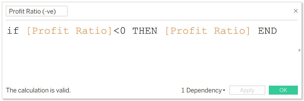
Change the default properties of the calculated number format to percent.
Add the two calculations to the tooltips.
Apply color according as shown below.

Next, let’s add shapes or indicators by creating following calculations.


Note: You can copy the above shapes directly to your calculations from this site.
Add the above calculations to the tooltips and customize accordingly as shown below.

See the resulting custom formatted tooltip.

Conclusion
Conditional formatting in Tableau tooltips is one of those subtle enhancements that quietly transforms how users experience a dashboard. By combining calculated logic, symbolic indicators, and lightweight text styling, you can turn a simple hover interaction into a meaningful cue that guides attention and clarifies performance at a glance. It’s a small design choice with an outsized impact, helping users interpret data faster and with greater confidence.
As dashboards become more compact and insight‑dense, tooltips offer a flexible space for nuance - letting you surface warnings, highlight successes, and reinforce narrative context without altering the main visualization. Mastering conditional formatting in tooltips ultimately strengthens your storytelling, making your dashboards not only more informative but more intuitive for every user who interacts with them.
If you like the work we do and would like to work with us, drop us an email on our contacts page and we’ll reach out!
Thank you for reading!!