
Designing Mobile-Friendly Dashboards in Tableau
- Bernard Kilonzo

- Aug 9, 2025
- 4 min read

Overview
A mobile-friendly dashboard is a data visualization and reporting interface specifically designed to function optimally on mobile devices such as smartphones and tablets. It enables users to access, interpret, and interact with key metrics and insights in a format that is visually clear, functionally intuitive, and responsive to varying screen sizes and touch-based navigation.
Here’s a breakdown of the things you should consider to design mobile-friendly dashboards in Tableau:
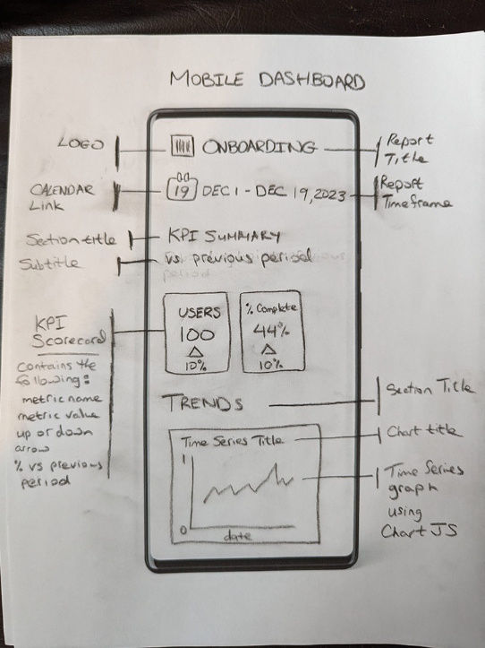
1. Sketch your dashboard layout
Sketching your dashboard layout is essential when designing mobile-friendly dashboards because it helps you plan the user experience, organize content hierarchically, and anticipate space constraints before development begins. Displaying controls at the top ensures users can easily access filters and settings without scrolling, maintaining clarity and context. Prioritizing vertical scrolling aligns with natural mobile navigation, offering a smoother and more intuitive experience. Limiting visuals per screen prevents cognitive overload, enhances readability, and keeps performance optimized - allowing each screen to deliver a focused, actionable insight.
2. Use filters and interactivity deliberately
When designing mobile dashboards, thoughtful filter implementation can make or break the user experience. Including an apply button with filters empowers users to fine-tune multiple settings before refreshing the data, which not only improves performance but also avoids unnecessary interruptions. Dropdowns and sliders are particularly effective on mobile - they’re compact, intuitive, and optimized for touch. But here’s the catch: too many interactive elements like buttons, toggles, or pop-ups can clutter the interface and distract users from the dashboard’s core insights. A clean, purposeful design keeps users focused and engaged, ensuring the dashboard remains a powerful decision-making tool on the go.
3. Use mobile friendly charts and fonts
When designing mobile dashboards, prioritizing mobile-friendly charts and fonts is crucial for delivering a seamless user experience. Mobile screens offer limited real estate, so charts must be clean, concise, and easy to interpret at a glance. Simple visualizations like bar charts, line graphs, and pie charts work best, as they communicate insights without clutter. Fonts play an equally vital role - choosing typefaces that are legible at smaller sizes ensures users can read data effortlessly without zooming or squinting. Consistent font styles and thoughtful spacing contribute to a professional look and help guide the viewer’s eye to the most important insights. Ultimately, optimizing charts and typography for mobile ensures that dashboards remain intuitive, informative, and impactful - no matter where they’re viewed.
4. Lock pan and zoom on maps
Locking the pan and zoom features in maps when designing mobile-friendly dashboards is essential to maintain clarity, usability, and focus. Mobile screens are small and touch-sensitive, making it easy for users to accidentally shift or zoom the map, which can disrupt the viewing experience and obscure key data points. By disabling these interactions, designers ensure that the map remains fixed on the intended geographic area, preserving context and preventing confusion. This approach also helps streamline navigation, allowing users to absorb insights quickly without the distraction of unintended movements. In essence, locking map interactions enhances the dashboard’s stability and ensures a smoother, more intuitive mobile experience.
5. Minimize tooltips reliance
When designing mobile-friendly dashboards, it's important to minimize reliance on tooltips to ensure a smoother and more intuitive user experience. On mobile devices, triggering tooltips can be tricky due to touch sensitivity and limited screen space, often leading to accidental taps or obscured data. Mobile users typically want quick, straightforward insights without having to interact with hidden layers of information. Instead of relying on tooltips, it's more effective to display key data directly within charts using clear labels, annotations, or summaries. This approach keeps the dashboard clean, accessible, and easy to navigate - perfect for users on the go.
6. Performance optimization
When designing mobile dashboards, performance is everything.
Start by reducing data volume: instead of loading full datasets, use extracts or aggregated data to keep things light and fast.
Next, limit the number of sheets on each dashboard - fewer sheets mean less to render, which translates to quicker load times and a smoother experience.
Finally, be smart about visuals: optimize images and backgrounds by avoiding high-resolution files or heavy graphics that can bog down performance. These simple tweaks can make a big difference in how your dashboard feels on mobile - snappy, responsive, and user-friendly.
7. Testing (Test, Test, Test)
Continuous testing and iteration are essential when designing mobile-friendly dashboards. It ensures that the final product delivers a seamless and intuitive user experience across diverse devices and screen sizes. Mobile environments are dynamic - varying in performance, connectivity, and user behaviour - so regularly testing helps identify layout issues, performance bottlenecks, and usability flaws early on. Iteration allows designers to refine visual elements, adjust data presentation, and optimize interactions based on real-world feedback. This ongoing cycle of improvement not only enhances functionality but also builds dashboards that are truly responsive, efficient, and aligned with user needs.
Conclusion
Designing mobile-friendly dashboards in Tableau isn't just a technical challenge - it's a strategic opportunity to make data more accessible, actionable, and impactful wherever users are. By embracing responsive layouts, simplifying visualizations, and optimizing for touch interaction, you empower decision-makers to stay informed on the go.
Tableau’s built-in mobile features, such as device-specific layouts and interactive controls, make it easier than ever to tailor dashboards for smaller screens without compromising clarity or functionality. But the key lies in thoughtful design: understanding your audience, prioritizing essential insights, and continuously testing across devices.
In a world where mobility drives agility, a well-crafted mobile dashboard can be the difference between reactive and proactive decision-making. So, whether you're building for executives, field teams, or remote analysts, designing with mobile in mind ensures your data speaks clearly - no matter the screen.
If you like the work we do and would like to work with us, drop us an email on our contacts page and we’ll reach out!
Thank you for reading!