
Adding Error Bars in Tableau Reports
- Bernard Kilonzo

- Mar 28
- 2 min read

What are Error Bars?
Error bars are visual markers on a chart that show the uncertainty or variability around a measured value, extending above and below a data point to indicate the range within which the true value might fall. They often represent standard deviation, standard error, or confidence intervals, and interpreting them involves looking at both their length and overlap: longer bars signal greater variability or lower precision, while shorter bars suggest more reliable estimates. When comparing groups, overlapping error bars can hint that differences may not be meaningful, whereas clearly separated bars suggest stronger evidence of a real difference - though overlap alone never guarantees statistical significance. Error bars essentially help you judge how much confidence to place in each value and whether observed differences are likely due to real effects or just natural variation.
Step-by-Step Guide
Using the Sample-Superstore dataset, create your view as follows.
Drag Sub-Category to the columns shelf.
Drag Discount to the rows shelf (aggregate using Average).
This creates a basic bar chart as shown below.

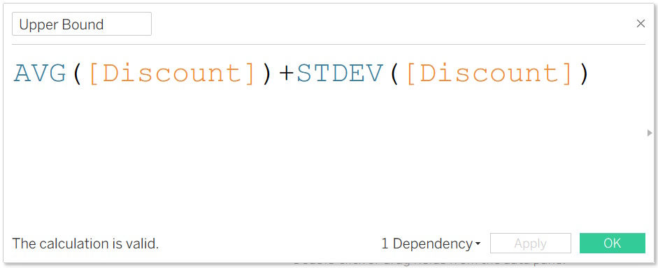
Calculate the lower and upper bound using the following calculations.

Add the lower and upper bound to the view as reference bands.
To do so.
Drag the lower and upper bound calculations to the detail shelf.
Right-click on the axis and select Add Reference Line.
Choose Reference Band and configure as follows.

Executing the above creates the view below. Showcasing the Average discount as well as the variability around the mean.

Conclusion
Creating error bars in Tableau isn’t just a technical exercise - it’s a way to bring statistical honesty and clarity into your visualizations. By pairing your measures with standard deviation, standard error, or confidence intervals, you give your audience a clearer sense of how much trust to place in each data point. Whether you’re analyzing survey results, monitoring program performance, or comparing experimental outcomes, error bars help shift the conversation from raw numbers to meaningful interpretation. With the techniques covered in this article, you now have the tools to build more transparent, credible, and analytically rigorous dashboards in Tableau.
If you like the work we do and would like to work with us, drop us an email on our contacts page and we’ll reach out!
Thank you for reading!!