
How to create a Sunburst Chart in Tableau
- Bernard Kilonzo

- Nov 25, 2022
- 3 min read
Updated: Jan 8

Introduction
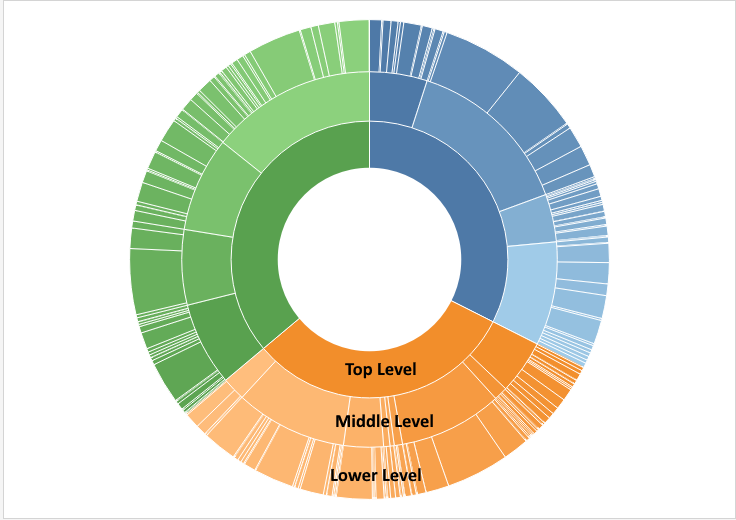
Sunburst chart is used to visualize hierarchical data through a series of rings that are partitioned into different categories. Each level of the hierarchy is represented by one ring with the inner most ring being the top of the hierarchy.
Note, a Sunburst without hierarchical data (a single level category) simply is a donut/doughnut chart.
Example of a Sunburst chart (3 level hierarchy)
Step by step guide
In this case I am going to create a sunburst chart to visualize products (which is hierarchical data) by sales.

First, let’s create a placeholder inform of a geographic field using the calculation below.
(Note, we’re using a geographic field to enable us to create multiple layers of the same view – in this case multiple layers of a donut chart)

Drag the above calculation (which is a geographic field) to the detail shelf to create a single point on a map.

Add another layer by simply dragging ‘Placeholder’ to the Marks Layer as shown below.

(Note the multiple map layers feature is only available in Tableau 2020.4 and newer versions)
Add more layers to accommodate the different levels of the hierarchy.
For this case, I have 3 levels of hierarchy – which means I need six rings (3 to accommodate the different categories of the hierarchy and 3 to separate each category from the next).
See the six layers I have added by dragging Placeholder to the Marks Layer.

Next, change the marks card of each layer to Pie - and remove Latitude (generated) and Longitude (generated) from the rows and columns shelf.

Choose the top pie, ‘Placeholder (6)’ and change the background color to white.

Select the next pie ‘Placeholder (5)’ and drag the hierarchy field Product to the color shelf and Sales to the Angle. Adjust the size (increase the size) to make the categories visible. Add a white bolder to separate each category.

Select the next pie ‘Placeholder (4)’ and change the background color to white. This ring will be separating the top-level category from the next. (Note you can adjust the size of the ring until you get the perfect gap).

Select the next pie ‘Placeholder (3)’ and add the hierarchy field Product to the color shelf, drill-down this hierarchy field to the next level ‘Sub-Category’ and change it from detail to color – add Sales to the Angle. Adjust the size of the ring to make it visible and add a white bolder to separate the different Sub-categories.
Edit the legends to ensure each Sub-Category matches the higher hierarchy (Category) in color.

Select the next pie ‘Placeholder (2)’ and change the background color to white. This ring acts as a separator between the 2nd level hierarchy and the 3rd level.
Lastly select the bottom pie, ‘Placeholder’.
Drag the hierarchy field ‘Product’ to the color shelf. Drill-down this field to the last hierarchy and change the fields from detail to color.
Drag Sales to the Angle shelf.
Adjust the ring (increase its size) to make it visible.
Add a white bolder to separate the different manufacturers.

(Note you can replicate the same procedure to add more rings to visualize your hierarchy data)
Conclusion
Next, you’re visualizing any hierarchical data, rather than using drill-down tables and tree maps, try the ideas shared here in this article to create an alternative way of visualizing hierarchical data.
I hope this article was helpful to you. If you wish to receive more Tableau tips and tricks, kindly join our mailing list by subscribing below.
If you like the work we do and would like to work with us, drop us an email on our contacts page and we’ll reach out!
Thank you for reading!