What-If Analysis in Tableau
- Bernard Kilonzo

- Nov 4, 2022
- 2 min read
Updated: Jan 7, 2025

Introduction
What-if analysis is a decision-making tool that helps businesses experiment with different variables to see how changes would affect the outcomes of a situation or a scenario.
A good example of a what-if analysis scenario would be.
What will happen to my revenue if I increase the service fee by 2%?
How much will I compensate the sales team if I increase the commission rate by 10%? etc.
These are just but a few scenarios what-if analysis can be applied to.
What-if analysis scenario – using sales data
In this case using Tableau parameters, I created this dashboard – which can help a sales Manager experiment with sales data to see how adjustments on base salary, commission rate, and target sales would affect the overall compensation of sales team and performance.
The first part of the dashboard looks at how the overall performance of each sales rep would be affected if the target sales was increased or decreased by some percentage (could be 2%, 10%, 50% etc.).
(Note these computations are based on the previous performance (previous actual & target sales) – an experiment that would be helpful when coming up with new targets based on previous performance)
For example, increasing the target sales by 5% shows that the Sales representatives such as Dickson, Duke, Janet, and Lewis will still be performing above the new targets based on the previous performance.

If the target sales were to be increased by 20%, based on the previous performance, most of the sales reps’ performance would fall between 75 to 100%. (An experiment that would help a sales Manager draft new targets based on individual’s previous performance).

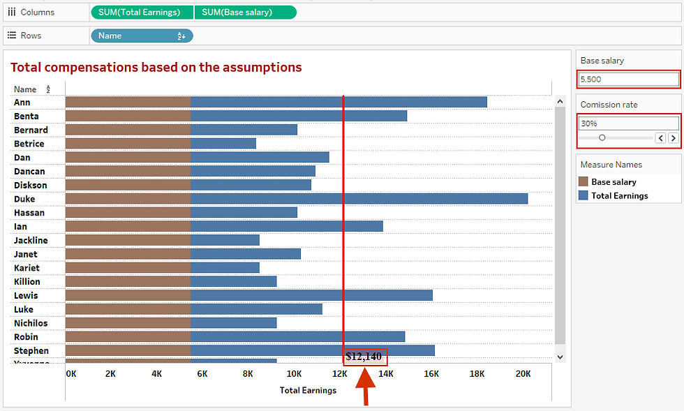
The second part of this dashboard looks at how the sales representative’s compensation would be affected if the based salary and commission rate was adjusted.
For instance, adjusting the base salary from 5,000 to 5,500 and commission rate from 25% to 30% increases the average compensation from 10,534 to 12,140.

What-if analysis dashboard
Combining the above views creates a what-if analysis dashboard which a sales Manager can use to experiment with sales data.
Interact with the live dashboard here, or by clicking on the dashboard image below.
I hope this article was helpful to you. To receive more tips on data visualization with Tableau, kindly join our mailing list by subscribing below.
If you like the work we do and would like to work with us, drop us an email on our Contacts page and we’ll reach out!
Thank you for reading!

