
How to Create a Gantt Chart in Tableau
- Bernard Kilonzo

- Nov 5, 2019
- 2 min read
Updated: Apr 13

Introduction
The series, Tableau chart has always focused on one thing, helping Tableau users learn how to create different charts and graphs hence equipping them with different techniques of telling each data story.
Inspired by the mission of this series, this article will guide you on a step by step procedure for creating a Gantt chart in Tableau.
What is Tableau Gantt Chart?
Gantt chart is a type of bar chart that illustrates project schedule. This chart lists the tasks to be performed on the vertical axis, and time intervals on the horizontal axis. The width of the horizontal bar in the graph shows the duration of each activity.
Gantt charts also illustrate the start and finish dates of the terminal elements and summary elements of the project (work breakdown structure of the project).

(From this sample Gantt chart, you can see the tasks (viz, emails, …etc) and the assigned personnel (Lucy, Benson, ...etc) on the vertical axis. While duration's of these tasks are indicated by the length of the bar).
Data set
For the purpose of this article, I’ll be using data in the snapshot below.

This dummy data on ‘content marketing project’ shows the different tasks assigned to different experts, with each task assigned a certain duration to take (start date and end date).
You can download the data set here to follow along.
Step by Step Guide
Our goal is to create a simple Gantt chart that will enable the supervisor easily track the progress of this project.
Once connected the above data set to Tableau app;
Step 1.0
Drag dimension field ‘Expert Assigned’ and ‘Task’ to the rows shelf.
Drag date field ‘Start date’ to the columns shelf. Set level of details as Exact Date – continuous field.
Choose ‘Gantt Bar’ under marks card.

Step 2.0
Compute task duration using the calculation below;

Step 3.0
Drag above calculation ‘Task duration’ to the Size shelf.
Drag dimension ‘Task’ to the color shelf.

Show additional details on the tooltip.

Preview of the tooltip when you hover on the viz.

Final viz.
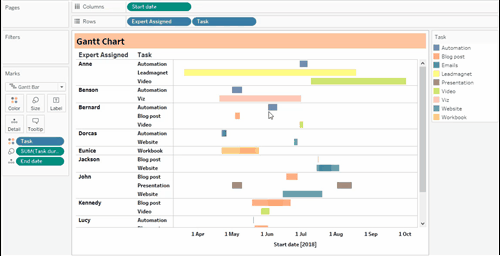
With this simple Gantt chart, the supervisor can see at a glance which task is currently ongoing (in a real example), the individual responsible and duration of the task.
Any other additional details on the project can be added on the tooltip.
Adding parameter date filters can help improve user experience by enabling the supervisor for this case filter the dashboard based on a date range.
If this post was helpful to you, kindly subscribe to the email list below to receive more of these Tableau tips and trick direct in your inbox.
Thank you for reading.