Tableau Tips: Title color legends
- Bernard Kilonzo

- May 15, 2018
- 2 min read
Updated: Apr 13

In the series Tableau tips, we strive to explore on small hacks which can greatly impact on our dashboards if used well. In the midst of dashboard creation process are decisions to be made on what insight to show and what not to show, while this may be a simple decision to make in assignments with few objectives and data, it can really be difficult when a lot is required in the analysis. In such projects, any space in the dashboard must be wisely used for the right message to be communicated. Therefore it is the goal of every analyst to minimize the unnecessary noise in the dashboard. One of the simplest technique is being conservative with use of colors. It's advisable to use a maximum of three colors in your dashboard, but even with good use of colors, in the fight to utilize space of your dashboards, these legends may appear to be consuming too much space. Therefore, I am going to cover in this article one of the simplest technique to deal with legends whenever your dashboard space is insufficient.
But first, it's good you understand what a color legend is. Color legend can simply be defined as a multi-line block of text describing what colors in a structure mean. Using Superstores data set packaged with Tableau app, I have created a simple Line chart using Months, Sales and product Category to demonstrate the same.

In the event you want to maximize on your space as well as maintaining the massage you're sending out through your dashboard. It's advisable to separate what MUST be present from what depends on availability of space. And a simple place to start with is the title. Every dashboard must have a title, and therefore finding a way of using your color legend with title can save a lot. This techniques, requires one to have category's presented by the color legend as part of the title, then apply colors as they appear in the chart. So, let me construct my title as 'Sales Performance of Furniture, Office Supplies & Technology' see below.

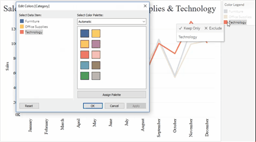
Lets, apply the color legend on the title. But, first you need to find the color code. To find the color code, go to edit colors then double click on the color to read the code. See below.

Now that I have the color codes, I can go a head and apply them on the title, as shown below.

Now, that the color legend has been replicated on the title, I can do away with the it to maximize on my space. See below how my chart appears.

Looking at the final chart above, you can clearly tell which line represents which category even without the presence of the color legend by looking at the title. The importance of this technique may not come out well here because we've a lot of space. But, be assured in the time of delivering on value where a lot of metrics are being monitored, this could be a savior.
Hopefully this article was insightful and informative at the same time.
Thank you for reading.
