
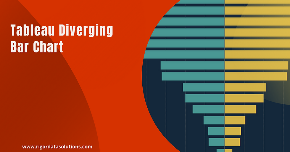
Tableau charts: Divergent bar chart.
- Bernard Kilonzo

- Feb 14, 2018
- 2 min read
Updated: Apr 13
Definition
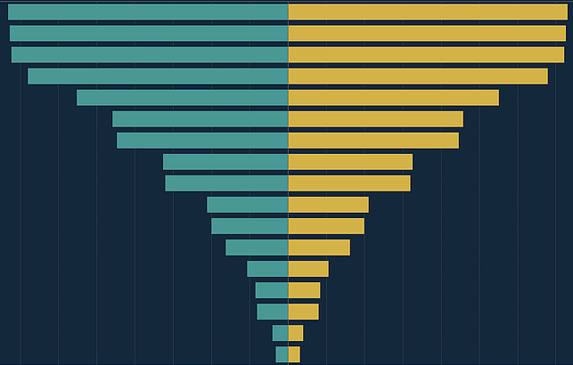
Divergent bar chart is a form of bar chart that has marks for some dimension members point up or right, and marks for other dimensions pointing in the opposite direction (down or left respectively). Divergent bar chart is useful when comparing two measure fields. Commonly used to create population pyramid.
Example of a divergent bar chart
Best practices for creating a divergent bar chart
Always use distinct color code to show fields being compared.
Always label the chart clearly.
Provide additional details on the tooltip.
Data set
In this article, we’ll be using Superstores data set to visualize the East and Central region sales for different product Sub-categories using a divergent bar chart.
You can download the sample data set here to follow along.
Step by step guide
The first thing you need is to find the sales for East and Central regions by creating the calculated fields shown below;


Procedure 1
Drag dimension field Sub Category to the Rows shelf.
Drag both the measure fields Central (Sales) and East (Sales) to the Columns shelf.
Right click on the axis of the first measure field and select Edit axis >> Choose Reversed Scale.

Procedure 2
This technique is the same as the first one, only that we are going to apply use of ad-hoc calculation to perform the same procedure above.
Drag the Sub-Category field, Central (Sales) and East (Sales) to the respective shelf's as in the first example.
Double click on the first measure field and add (-) sign on the left side >> press okay.
Sort the Sub Category's.

Note, the second procedure introduces negative values on left chart. This can be rectified by hiding the axis and dragging the measure field with negative values to the label. See below.

I hope this article was helpful to you. To receive more of the Tableau tips and tricks, kindly join our mailing list by subscribing below.
Thank you for reading.